Course welcome 👋

Hello and welcome to the SuperHi React course.

In this 4 week course we’ll be diving into React and learning why it’s taken the web industry by storm, what problems it solves and why it’s so great.

As we do with all our courses, we’ll learn by getting stuck into some fantastic real-world projects and focussing on building useful things from the get-go.

Lost in Tokyo 🇯🇵

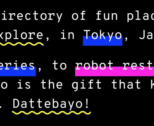
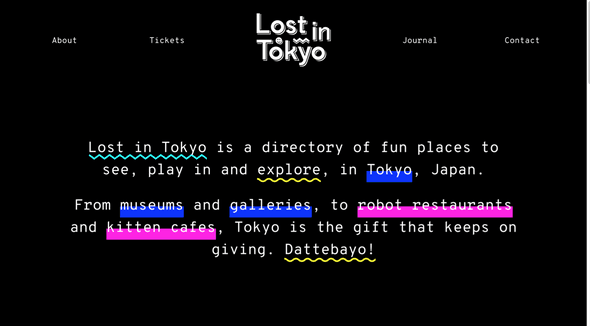
Our first project, Lost in Toyko, is a website that showcases the hippest and trendiest spots in Tokyo.

Lost in Tokyo screenshot

For our first week project, Lost in Tokyo, we will be:

  • Learning what problems React solves
  • Thinking about our pages as components
  • Translating regular HTML into React code
  • Working with data in React
  • Using events and state in React
  • Working with CSS toolkits for our page design

What is React?

React lets us build our user interfaces and websites in Javascript. We write all of our HTML inside of Javascript files using React’s special syntax called JSX. It smartly pieces everything together for us and renders it onto the page.

It’s based on an old school language called XML (which is essentially just HTML but designed for data, letting you give your elements any names).

Here’s an example of some JSX code, it’s pretty familiar looking:

// some regular html code
<div>
  // as well as react components which look like this
  <Component>
</div>

React’s JSX part of the code isn’t real Javascript, which means we have to convert it into Javascript. But we’ll get into that a bit later on…

Why is React good?

React is great because it gives us less to think about when building rich websites and apps. We build our page using components, and tell the components what to display by giving them data (React calls these props).

When our data changes, so does our page. No manual work required.

React does all the work of automatically figuring out what needs to update where. It does it with its speedy and clever internal system called the virtual DOM (which is just a scary technical name for HTML in Javascript). This lets us build up very advanced and interactive applications with ease.

What is a component?

React components are like LEGO building blocks. We can use and reuse them in multiple places to build up any number of variations for our page.

Lost in Tokyo screenshot

We might have one that displays a username, an avatar image or perhaps a list of shop items. Through using components in React we can massively cut down on repeated code, keeping things very lightweight and flexible.

A component using React

Most of the components we’ll be building are just regular Javascript functions. They take in data called props and will give us HTML as the output.

Let’s make a component that says hello to us:

// anything between {curly} brackets will be our variables
const Hello = props => <h1>Hello {props.name}</h1>

We can then use the component like this:

// gives us <h1>Hello Lawrence</h1>
<Hello name="Lawrence" />
// gives us <h1>Hello Rik</h1>
<Hello name="Rik" />

In our project we’re going to be using lots of components to break up our website into lots of building blocks! We’ll also be making some smarter components which deal with state in React, but we’ll worry about those later on.

Modern Javascript in React

In this course we’ll be introducing lots of modern Javascript syntax and taking advantage of the latest and greatest of what Javascript has to offer.

The new language features are designed to make Javascript easier and more elegant to write, but can be a little confusing at first.

We’ll do a little roundup refresher on the following new features:

  • const instead of var
  • Arrow functions
  • Template strings
  • Destructuring in functions
  • Spread operators

If some of these new features don’t make sense immediately that’s totally fine, they’ll become more familiar as we go along and use them in the projects — it’s better to see them in action!

const instead of var

In Javascript we’re used to declaring variables like this:

var name = 'lawrence'

In modern Javascript we swap the var for const instead (it’s short for constant):

const name = 'lawrence'

const is preferred here because it doesn’t allow us to overwrite the variable, making our code more robust. When we need a new variable we declare a separate one instead of overwriting.

We also have let, but we’ll worry about how to use that when we encounter a scenario for it in later weeks.

Arrow functions

Usually when we write functions they look like this:

var toUpperCase = function(name) {
  return name.toUpperCase()
}
// or like this…
function toUpperCase(name) {
  return name.toUpperCase()
}

We can now rewrite that first function to use the new arrow syntax. It’s more concise and also easier to read.

// the arrow points directly at the name.toUpperCase()
// it means we don’t need to write return, it’s done for us
const toUpperCase = name => name.toUpperCase()
// is the same as also writing…
const toUpperCase = name => {
  return name.toUpperCase()
}

When we have multiple arguments (bits of data we send into our functions), they need to be wrapped in round brackets:

const fullName = (firstName, lastName) => {
  return firstName + ' ' + lastName
}

If there’s just a single argument, we don’t need to put round brackets around it, like in our toUpperCase examples.

Template strings

These are a fantastic and massively useful new feature. Say for example we have some info about me:

const firstName = 'Lawrence'
const lastName = 'Gosset'
const age = 26

If we want to combine these variables amongst regular text, it would traditionally look like this:

const sentence = 'My name is ' + firstName + ' ' + lastName + ' and I am ' + age + ' years old'

Every time we want to join text together we need to remember the blank spaces and the + symbols to concatenate our sentence together. It does get a bit difficult to manage and read.

With modern Javascript, using backticks we can embed variables right into our sentence:

const sentence = `My name is ${firstName} ${lastName} and I am ${age} years old`

Every time we have a variable we put it inside ${} our dollar brackets and it gets embedded.

This makes our code much easier to read and we’ll be using this trick a lot to join together things like class names in our React components.

Destructuring

Destructuring really means grabbing things that are inside of objects and arrays directly. We’ll just be worrying about objects to begin with, and dealing with arrays later on.

Say for example we have some data about SuperHi in a company variable:

const company = {
  name: 'SuperHi',
  location: 'New York',
  ceo: 'Rik Lomas',
  founded: 2013,
}

We could make some extra variables from our company like this:

const name = company.name
const location = company.location
const ceo = company.ceo

See the repetition there? With destructuring we can assign those three variables in one go:

// it assumes we have `name`, `location` and `ceo` properties in `company`
const {name, location, ceo} = company

We could write a function that gives us back some company info:

const company = {
  name: 'SuperHi',
  location: 'New York',
  ceo: 'Rik Lomas',
  founded: 2013,
}

And then use the data like this:

const companyInfo = company => {
  return `${company.name} is based in ${company.location}`
}
// run the function
companyInfo(company)

With destructing we can instead grab the data we want right inside of the function arguments:

const companyInfo = ({name, location}) => {
  return `${name} is based in ${location}`
}
// run the function
companyInfo(company)

This is useful as it neatens up code and repetition.

Destructuring is a bit confusing at first but once you’re exposed to it it will click into place. We’ll be using it to grab props inside of our React components to neaten things up.
Spread operators

Spread operators let us take the data inside of objects and arrays and lay them out and combine them together easily.

Say for example we have some data:

const person = {
  name: 'Lawrence',
  age: 26,
  location: 'Melbourne',
}

const faves = {
  food: 'Salmon sushimi',
  emoji: '💯',
  music: 'Grooves',
}

If we wanted to join these two bits of data together we could write:

const info = {
  name: person.name,
  age: person.age,
  location: person.location,
  food: faves.food,
  emoji: faves.emoji,
  music: faves.music,
}

See the repetition here? Also as our data grows we have a lot of typing out to do!

What we can do is to write this instead:

const info = {
  ...person,
  ...faves,
}

It will take all of the properties inside of person and faves, unbox them from their wrapping curly brackets {}, and then lay them out for us inside of our new info object.

We go into spread operators a bit later on in this project for how we pass our component properties around without having to manually type them all out.

Our project structure

For our first week we’re going to keep our website’s structure simple and worry about things like node, npm and webpack next week. They’ll add too much unnecessary confusion in for what we want to achieve now, which is learning React!

We’ll stick with a structure we’re familiar with for regular website projects, but with the addition of a data folder, which we’ll be storing our data in for React to use.

index.html
js/
→ app.js
→ react.js
→ react-dom.js
data/
→ attractions.js
→ menu.js
css/
→ tachyons.css
→ main.css
images/
→ our image files

Our index.html file

Looking at our HTML file, there’s a couple of things we’ll be doing differently when using React.

Firstly, the only real HTML code we’ll have in our body is an element that our React code will mount onto:

<!-- this is the element where react will mount onto -->
<div id="root"></div>

Secondly, because we’re writing JSX code, we need to transform it back into regular Javascript. For that we’ll use a tool called babel, which takes modern Javascript and React code and converts it into Javascript that works in older browsers.

<!-- taken from https://gist.github.com/RickWong/ad9cd9bd96884847cd05b352cb4e90e1 -->
<script src="https://cdnjs.cloudflare.com/ajax/libs/babel-standalone/6.7.7/babel.min.js"></script>
<script>
  // here we tell babel to grab our code and convert it to regular javascript
  fetch("js/app.js").then(function (response) {
    response.text().then(function (js) {
      eval(Babel.transform(js, {
        presets: ['es2015', 'react']
      }).code);
    });
  });
</script>

The React developer tools

To make our lives a lot easier, the React team built a set of developer tools that help us inspect and debug our React applications.

We can also use it to inspect other websites that use React, so if you fancy scaring yourself… go ahead and check out Facebook!

React dev tools

You can download them free from the Google Chrome Store.

Picking a code editor

We’ll be using a code editor to build our project. They’re a bit like Microsoft Word but with monospaced fonts, dark backgrounds and won’t crash on you unexpectedly.

Right now there are three popular choices of code editor:

Visual Studio Code

Made by Microsoft but surprisingly excellent, I use this for its performance and focus on Javascript development. Also free!

Atom

Made by Github and completely free. Lots of great plugins and a huge userbase and community.

Sublime Text

A paid but classic choice for a very high performance code editor. Made by independent developers.

Running our project

If we want to make use of the React developer tools for our own project, we have to run our website on our own computer as if it’s a server.

The easiest way to do that is by first loading up the Terminal (in Applications → Utilities → Terminal), and then navigating to our project.

Alternatively Hyper is a really great terminal to use for Windows, Mac and Linux.

If it’s on the desktop, we’d find it like this:

cd Desktop/lost-in-tokyo/

And once we’re into the folder of our project, run the command:

python -m SimpleHTTPServer 5000

Then navigating to localhost:5000 will take us to our project running as a server.

Another solution, if you’re on Windows is to run your website using Fenix.

Adding our first component

Let’s go ahead and add a simple component to our site that says hello.

// create a Hello component that has a name prop
const Hello = props => <h1>Hello {props.name}</h1>
// here we render our react application onto our root element
ReactDOM.render(<Hello name="Lawrence" />, document.getElementById('root'))

Styling our components

In React there are loads of ways we can add style to our components… it’s on of the hottest topics in the React community at the moment. We can write them in separate CSS files, or in the components themselves.

For this project we’re going to go with the solid and well know way of writing our styles in CSS and then using class names on our elements to link to those styles.

Remember to use className

The key difference with React is that we use className instead of class. It still catches me out all the time so when your styles aren’t working, always remember to double check it!

// when adding classes we use className instead of class
const Hello = props => <h1 className="title">Hello {props.name}</h1>

With that in place we can then write some styles for our Hello component:

.title {
  font-family: sans-serif;
  font-weight: 400;
  color: blue;
}

Using tachyons for CSS help

The focus of this project is going to be React and Javascript, so we’ll try to keep CSS to a minimum. For that, we’ll use tachyons to help us with more rapid styling.

Tachyons is a lightweight CSS library that breaks down common CSS properties into reusable classes that we write into our HTML.

Its key benefit is that it allows us to “create fast loading, highly readable, and 100% responsive interfaces with as little css as possible.”

Let’s go ahead and add some tachyons classes to our component:

// f1 makes the font size 1 on the type scale
// tc centers the text (text center)
// sans-serif makes it… sans-serif!
// blue makes it… blue!
const Hello = props => <h1 className="f1 tc sans-serif blue">Hello {props.name}</h1>

We’ll get into the swing of how to use tachyons classes as we go through this project. They’re really great, super powerful and keep our CSS very lightweight.

One thing you’ll need to adapt to is using lots of class names… which is a very good CSS practice.

Multiple components together

With Lost in Tokyo, we’ll be combining together multiple components to build our site. What we’ll do is to house everything inside of an App component that pieces together our whole site.

Here’s an example of how we can piece together multiple components:

// a Title component
const Title = props => <h1 className="tc">{props.title}</h1>

// another Banner component
const Banner = props => (
  <h1 className="tc yellow f1 pa3">
    Hello {props.firstName} {props.surname}
  </h1>
)

// our components always need a single wrapper element at the top
const App = () => (
  <div>
    <Title title="Welcome to my website!" />
    <Banner firstName="Lawrence" surname="Gosset" />
  </div>
)

ReactDOM.render(<App />, document.getElementById('root'))

Our app component

For our App component that contains all of our page, we’re going to add a few tachyons classes to it to get it styled up how we want.

Firstly, we’ll wrap the entire thing in a div tag like React requires us to, and then inside of that we’ll have two more divs.

The first child div tag will:

  • min-vh-100 — take up a min height of 100vh
  • ph4 — 4 units of horizontal padding
  • flex — enable flexbox
  • flex-column — use flexbox as columns

The second child div tag will:

  • flex — enable flex
  • flex-wrap — let the boxes wrap onto new lines
  • container constrain the width of our page
const App = () => (
  <div>
    <div className="min-vh-100 ph4 flex flex-column">
      {/* our navigation component */}
      {/* our intro text component */}
    </div>
    <div className="flex flex-wrap container">{/* our attractions list component */}</div>
  </div>
)

Our intro text component

For our intro text, we’re going to wrap it in a few div tags. The outer one will set the font styles, element sizing and spacing using tachyons classes.

The inner one will just add a bit of space between our two blocks of text using the .mb3 class for small screens and the .mb4-ns for a larger margin on non-small (ns) screens.

const Intro = () => (
  <div className="m-auto-ns f4 f3-m f2-l tc w-80-l normal">
    {/* a div with a margin-bottom (mb3 and mb4 on non-small screens) */}
    <div className="mb3 mb4-ns">
      Lost in Tokyo is a directory of fun places to see, play in and explore, in Tokyo, Japan.
    </div>
    <div>
      From museums and galleries, to robot restaurants and kitten cafes, Tokyo is the gift that
      keeps on giving. Dattebayo!
    </div>
  </div>
)

Highlighting words

React dev tools

To highlight words from our intro text we’re going to create a Highlight component. This component is a little different because it will actually have content inside of it (our highlighted words).

const Quote = () => (
  <div>
    <Highlight>Back</Highlight> of the <Highlight>net</Highlight>!
  </div>
)

Our Highlight component will then look like this:

const Highlight = props => <span className="highlight">{props.children}</span>

We can get the content from our Highlight component by using props.children. It would work the same if we had more components or elements inside of our Highlight as well as just text.

Adding highlight colors

We can make our highlight component a little bit smarter by attaching a color to them.

A new thing we’re doing is to use a trick called destructuring to get our children and color props straight from the function (highlighted below). This saves on typing and neatens things up.

// here we grab the props straight inside the function arguments
// we do it by using curly brackets and naming the ones we want
const Highlight = ({children, color}) => (
  <span className={`relative highlight highlight-${color}`}>
    <span className="relative z-2">{children}</span>
  </span>
)
// we can then use it like this
<Highlight color="blue">Highlight me!</Highlight>

This will give us this HTML:

<span class="relative highlight highlight-blue">
  <span class="relative z-2">Highlight me!</span>
</span>

Something else new we’re doing is to add the hint color to the end of our classes. When we use backticks we can join text together with variables. The name for this is a template string.

So where we say:

const color = 'blue'
const classes = `relative highlight highlight-${color}`

classes would be equal to 'relative highlight highlight-blue'

The same as if we did:

const firstName = 'Lawrence'
const lastName = 'Gosset'
const fullName = `${firstName} ${lastName}`

fullName would be 'Lawrence Gosset'

Creating components with data

When writing React code where we have repeating components, we can take advantage of the fact we’re using Javascript and build multiple components from data.

Say for example we have an array (list) of the SuperHi team:

const team = ['Lawrence', 'Rik', 'Milan', 'Krista', 'Ryan', 'Adam']

Using Javascript’s map feature we can loop over our people and create a list of them like this:

const People = people => (
  <ul className="team-members">
    {/* we loop over the members using map and create an <li> from each name */}
    {people.map(person => <li className="team-member">{person}</li>)}
  </ul>
)
// use the component like this
<People people={team} />

Whenever we loop over data to create components in React, we always use map.

Javascript’s map is a bit like forEach but it runs a function on every item and gives us back another array. You can think of it a bit like an array transformer.

Building our navigation from data

For our navigation, we’re going to follow the same idea and build it entirely from data.

Inside of our data folder we’ve got a file called menu.js which we’ve set up with an array of our navigation items:

// data/menu.js
const menu = [
  {
    children: 'Lost in Toyko',
    logo: true,
    className: 'order-3-ns w-100 w-30-ns mb3 mb0-ns',
    href: 'index.html',
  },
  {
    children: 'About',
    className: 'order-1-ns w-20',
    href: 'about.html',
  },
  // and so on…
]

It’s an array of Javascript objects which contain the props for each of our individual nav items, things like the children (nav text), classNames and href.

For our logo, we’ve also added a logo: true property which we can do some clever things with later.

Using our data, we can create our navigation like this:

const Nav = () => (
  <nav className="pt3 pt4-ns mb4 mb0-ns">
    <ul className="list flex flex-wrap flex-nowrap-ns justify-between items-center pa0 ma0">
      {menu.map(item => <NavItem {...item} />)}
    </ul>
  </nav>
)

Notice the NavItem component there? Rather than creating all of the code inside of the Nav, we’re going to separate out our navigation items into their own NavItem component too. We’ll get to that shortly!

Spreading our props

What does that {...thing} do?

That’s called an object spread. It takes our object’s properties and lays them out onto our component for us.

Say for example we have a lawrence object of data about me:

const lawrence = {
  name: 'Lawrence',
  age: 26,
  location: 'Melbourne',
  faveEmoji: '💯',
}

And then a component which displays that data:

// grab the props in the function to make things cleaner
const Person ({name, age, location, faveEmoji}) => (
  <div>
    <h1>{name} is {age}</h1>
    <p>Lives in {location} and likes {faveEmoji}</p>
  </div>
)

One way to use the component would be:

// see the repetition here?
return (
  <Person
    name={lawrence.name}
    age={lawrence.age}
    location={lawrence.location}
    faveEmoji={lawrence.faveEmoji}
  />
)

Rather that listing out each individual property, we can instead take them and spread them all out onto the element, which would do the exact same thing but with much less code:

// lays out all the properties onto our person component
return <Person {...lawrence} />

This trick is super useful. It saves on writing lots of manual code and we’ll be using a lot more moving forwards to pass props around.

Listing our attractions

Looking inside of our data folder at the attractions.js file, each of our data items looks like this:

{
  title: 'Mori Art Museum',
  description:
    'The Mori Art Museum strives to be a place for enjoyment, stimulation and discussion - a place where what is important in our culture and society is openly debated.',
  link: 'http://www.mori.art.museum',
  image: 'image_1.jpg',
  className: 'w-50-l'
}

With that we’re going to first create a basic Attraction component for each item:

const Attraction = ({title, description, image, className}) => (
  <div className={className}>
    <h1>{title}</h1>
    <p>{description}</p>
    {/* join our image file name onto the folder location */}
    <img src={`../images/${image}`}>
  </div>
)

We can then loop over our attractions and create our Attraction components:

attractions.map(attraction => <Attraction {...attraction} />)

Styling our attractions

Using some extra structure and tachyons classes we’re going to style up our Attracttion component:

const Attraction = ({title, description, className, image}) => (
  <div
    className={`ph4 ph5-ns ph0-l mb4 mb5-ns w-100 overflow-hidden pointer attraction ${className}`}
  >
    <div className="relative">
      <div className="absolute w-100 h-100 flex items-center pa3 pa4-ns bg-aqua overlay">
        <div>
          <h1 className="f4 f3-ns mt0 mb2 regular black normal lh-title">{title}</h1>
          <p className="lh-title lh-copy-ns mv0 black f6 measure-l">{description}</p>
        </div>
      </div>
      <img src={`../images/${image}`} className="db" />
    </div>
  </div>
)

A few of the classes explained:

  • pointer — sets the cursor to a pointer so we know these are interactive elements
  • overflow-hidden — hide our overflow so the info box can slide out of visible view
  • lh-title — gives a line-height of 1.25
  • lh-copyline-height of 1.5
  • measure-l — sets a max-width of 30em
  • db — sets display: block

Introducing class components

In React we have two ways we can create components. Until so far we’ve looked at creating our components using functions which are perfect for when we have data and then want to just display it.

const Title = props => <h1>{props.title}</h1>

When we want to add a bit more advanced functionality to our components, such as events and changing our data, we can use a class component. They require a bit more code and look like this:

class Title extends React.Component {
  render() {
    return <h1>{this.props.title}</h1>
  }
}

With a React class component, we get access to what are called lifecycle methods. They allow us to run functionality at certain points of the component’s loading, like when it’s rendered on the page and gets removed from the page.

We can also add in our own methods to handle functionality for us:

class Title extends React.Component {
  render() {
    return <h1>{this.props.title}</h1>
  }
}

When accessing our props in a class component, we have to use the this keyword to get them. This is because we’re using a class and this refers back to the component itself. We’ll do the same thing for functions we want to run inside our component as well.

The component lifecycle

When a class component is loaded, it goes through several changes which we can hook into and run code in. These are called the component’s lifecycle methods.

They are useful for setting up additional functionality up in our components (like getting external data when our component loads on the page).

We can use them like this:

class Title extends React.Component {
  componentDidMount() {
    console.log('component just mounted on the page')
  }
  render() {
    return <h1>{this.props.title}</h1>
  }
}
  • componentWillMount — called just before a component’s about to mount on the page
  • componentDidMount — called once a component mounts on the page
  • componentWillReceiveProps — called whenever a component gets new props
  • shouldComponentUpdate — telling your component when it can update (never really used)
  • componentWillUpdate — essentially the same as componentWillReceiveProps (never used)
  • componentDidUpdate — updating when props change (like componentWillReceiveProps again)
  • componentWillUnmount — called before a component is going to be removed

We won’t be using any of the lifecycle methods in this project, but they’re something we’ll get to grips with from next week.

More on React lifecycle →

Events in React

Let’s say we have a Title component that we want to add some functionality to:

class Title extends React.Component {
  doSomething() {
    console.log('very classy')
  }
  render() {
    return (
      <div onClick={this.doSomething}>
        <h1>{this.props.title}</h1>
      </div>
    )
  }
}

See that onClick event on the div? That’s how we do events in React. It’s how Javascript functions used to be written in HTML a long time ago, called inline Javascript:

<a href="#" onclick="alert('hello!')">Click Me</a>

React has lots of these built in, here’s just a few examples:

  • onDrag
  • onMouseOver
  • onChange (for when we type in inputs)
  • onSubmit (submitting forms)
  • onTouchStart

Dealing with state

State is data inside our components that we can change. It goes hand in hand with props to control functionality and store data inside of our components.

An example of state would be for something like a modal being toggled on or off or even for some data we’ve just fetched from a server. These things we’d store as state in our components.

An example of a Form component that updates with a person’s name when they type an input would look like this:

class Form extends React.Component {
  // constructor sets up our component
  constructor(props) {
    // used to get our state working
    super(props)
    // here we set our default state
    this.state = {
      fullName: 'Enter your name',
    }
    // we need to set up our updateName method
    this.updateName = this.updateName.bind(this)
  }
  updateName(event) {
    console.log(event.target.value)
    // we use this.setState to set and update our state
    this.setState({
      fullName: event.target.value || 'Enter your name',
    })
  }
  render() {
    return (
      <form>
        {/* we get access to state by using this.state */}
        <h1>{this.state.fullName}</h1>
        {/* runs updateName method every time we key press */}
        <input onChange={this.updateName} name="fullName" placeholder="Enter your name" />
        <button>Submit</button>
      </form>
    )
  }
}

A demo of it in action:

Toggling our info overlay

We can control whether our overlay shows or not by setting a true or false value in our Attraction component’s state, let’s call it showInfo:

class Attraction extends React.Component {
  constructor(props) {
    super(props)
    this.state = {
      showInfo: false,
    }
  }
  render() {
    // this is the same as writing const showInfo = this.state.showInfo
    const {showInfo} = this.state
    return (
      // we toggle the transform style using our state’s true or false value
      <div style={{transform: showInfo ? 'none' : 'translateY(-100%)'}}>
        <h1>Yayoi Kusama Museum</h1>
        <p>
          It could be said that it is Kusama’s second golden age. So after much anticipation, the
          Yayoi Kusama Museum finally opened its doors. We recommend getting tickets, as it’s
          deservingly popular.
        </p>
      </div>
    )
  }
}

To actually control our showInfo state to change when we click and mouse away, we need to set up some methods to handle it:

class Attraction extends React.Component {
  constructor(props) {
    super(props)
    // set our default state
    this.state = {
      showInfo: false,
    }
    // set up our methods
    this.toggleInfo = this.toggleInfo.bind(this)
    this.closeInfo = this.closeInfo.bind(this)
  }
  toggleInfo() {
    // running setState like this gives us the previousState and props
    // it makes sure we don’t
    this.setState((prevState, props) => ({
      // doing this will turn true to false and vice versa
      showInfo: !prevState.showInfo,
    }))
  }
  closeInfo() {
    // run setState the regular way to close the overlay
    this.setState({
      showInfo: false,
    })
  }
  render() {
    // here we toggle our transform based on the showInfo state
    // we run toggleInfo onClick to toggle between it showing and hiding
    // we use closeInfo on onMouseLeave to force close the info when we mouse away
    return (
      <div
        style={{transform: showInfo ? 'translateY(-100%)' : 'none'}}
        onClick={this.toggleInfo}
        onMouseLeave={this.closeInfo}
      >
        <h1>Yayoi Kusama Museum</h1>
        <p>
          It could be said that it is Kusama’s second golden age. So after much anticipation, the
          Yayoi Kusama Museum finally opened its doors. We recommend getting tickets, as it’s
          deservingly popular.
        </p>
      </div>
    )
  }
}

Separating our info component

To neaten things up we can separate out our Overlay component. When doing this we need to make sure we pass along all of our props as well as state.

class Attraction extends React.Component {
  render () {
    return (
      <div>
        {/* pass along all our props and state to the component */}
        <Info {...this.props} {...this.state} />
        {/* …our other components */}
      </di>
    )
  }
}

We can use our Overlay component as a function because it’s only displaying data here. These are often called ‘function components’, ‘stateless components’ or ‘dumb components’ (because they don’t do anything clever apart from displaying data based on the props we give them).

const Overlay = ({title, description, showInfo}) => (
  <div
    className="absolute w-100 h-100 flex items-center pa3 pa4-ns bg-aqua overlay"
    style={{transform: showInfo ? 'none' : 'translateY(-100%)'}}
  >
    <div>
      <h1 className="f4 f3-ns mt0 mb2 regular black normal lh-title">{title}</h1>
      <p className="lh-title lh-copy-ns mv0 black f6 measure-l">{description}</p>
    </div>
  </div>
)

Making some updates

For the homework this week we want to do a few things to our project.

1. Add the new image

We have an additional image we’d like to add from the images folder. Try adding it into the attractions.js data file.

  • filenameimage_10.jpg
  • classNamesw-third-l ml5-l

2. Change the click handler to be hover

Instead of sliding the info overlay in on click, we’d like to do it on hover instead. By using the React docs try and figure out which event to use to make it happen.

3. Adding the links in

See in the attractions.js data we sometimes have a link property? Using that property, add a link to the title of the attraction if it has that property.